Visualizing Realtime Drilling Data from a csv file with Plotly
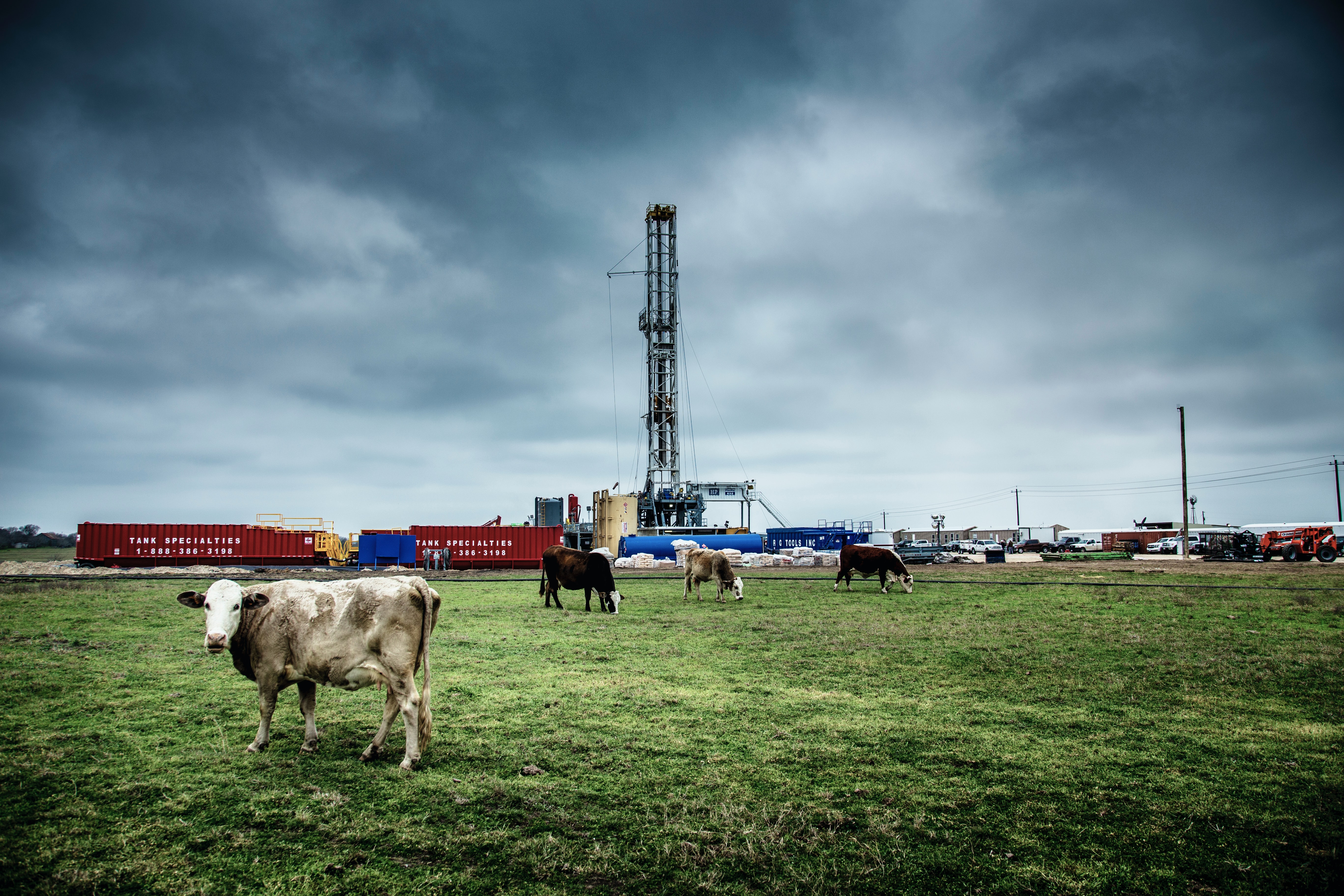 Photo by Donald Giannatti on Unsplash
Following a question on LinkedIn, here’s a quick post on how to import realtime drilling data from a large csv file and quickly visualize the data using plotly. The intent is to show how quick and easy realtime drilling data can be visualized using Python - this is not intended as a polished end product. It took about 30 mins to program this from scratch, including Googling.
Get the Data
To save myself the hassle of getting the WITSML data from Equinor’s Volve dataset and then parsing it into a csv file, I did I quick Google search and found that some kind person had already done it. Get your data from here (although I think they might be hosting it on a private server, so please don’t abuse).
QAQC the Data
I have to say, this is a quick, rush job and the quickest way I find to QAQC this sort of data is with a spreadsheet (in my case LibreOffice Calc since I use Ubuntu). For the data file I downloaded, many of the traces are blank, so I quickly made a list of the ones that have data and then commented out the ones that I’m not interested in.
Import the Data
Let’s start coding… here’s the libraries we’re going to use:
import pandas as pd
import os
from plotly.subplots import make_subplots
import plotly.graph_objects as go
We’ll use pandas to import and manipulate the data, os for managing filenames etc and plotly for the visualization.
We’ll now define our working path and a link to the data file. I tend to put my data files in a subfolder called data in my working folder and I use the os module because different operating systems use different methods for managing files and os takes care of this for me - for example, some operating systems use \ as a directory separator while others use /.
PATH = os.path.dirname(os.path.realpath(__file__))

# Assume that the data file is located in a subfolder called data
data_filename = os.path.join(
    PATH, *['data', 'Norway-Statoil-NO 15_$47$_9-F-1 C 0 time.csv']
)
Since this data file is pretty large, anything that can be done to reduce the size of the file when we load it into memory will help. So, based on that quick spreadsheet QAQC done earlier, here’s a list of the column headers that I’m going to import.
# I cheated here and took a look at the data in a spreadsheet - below is a
# list of headers that have data and I've commented out the ones that I do not
# want to plot in the figure.
headers = [
    'The mnemonic of the index curve ',
    'Block/Topdrive Position Compensated m',
    # 'Annular Velocity Monitor Maximum m/s',
    'Mud Flow In m3/s',
    # 'Cementing Flow In (measured) m3/s',
    # 'Cementing Fluid Density In kg/m3',
    # 'Cementing Stage Number unitless',
    # 'Cementing Fluid Temperature In K',
    # 'ECD at Casing Shoe kg/m3',
    # 'Cementing Individual Volume Pumped m3',
    # 'Cementing Cumulative Returns m3',
    # 'Pump Total Cumulative Stroke Sum unitless',
    # 'Mud Flow Out Percent Euc',
    # 'Cementing Flow In (calculated) m3/s',
    'Hookload N',
    # 'Pump 3 Stroke Rate Hz',
    # 'NoMonitor[0] Drilling[1] Reaming[2] OffBottom[3] InSlips[4] Connection[5] TrippingIn[6] TrippingOut[7] TripInSlips[8] ShutIn[9] Circulating (10) Rotating (100) -  112 means rotating, circulating, reaming, 013 means not rotating, circulating, off bottom . unitless',
    # 'Pump 2 Stroke Rate Hz',
    # 'Cementing Pump Pressure Pa',
    # 'Cementing Flow Out (measured) m3/s',
    # 'Cementing Total Volume Pumped m3',
    # 'Cementing Fluid Density Out kg/m3',
    'The mnemonic of the Hole depth m',
    # 'Cementing Fluid Temperature Out K',
    'Pump Pressure - Stand Pipe Pa',
    # 'RawData[0] unitless',
    # 'Pump 1 Stroke Rate Hz',
    # 'Cementing Cement Volume Pumped m3',
    # 'nameWellbore',
    # 'name'
]
As you can see, most are commented out, leaving just a handful. If you want to import more, then just uncomment them.
Now we have that sorted, we can load the data into a pandas.DataFrame.
# import the data - assign the first column as the index
df = pd.read_csv(
    data_filename, skipinitialspace=True, usecols=headers, low_memory=False,
    index_col=0
)
The file’s large so it’ll take a few seconds to load in the data. The time stamps in the data file are located in the first column and I want to use that as the index so set index_col=0 and the usecols=headers is telling pandas to only import the columns that are in the list I created above.
We’ll now clean up the data a little. When the time data imported it didn’t recognize it as datetime so we need to correct that. We’ll also change the name of the index and the depth column.
# change the index and depth names to something more intuitive and make the
# index datetime
df.index.names = ['Time']
df.index = pd.to_datetime(df.index)
df.rename(
    columns={
        'The mnemonic of the Hole depth m': 'Depth m'
    },
    inplace=True
)
You can easily get a quick summary of the DataFrame:
>>> df.info
<bound method DataFrame.info of                            Block/Topdrive Position Compensated m  Mud Flow In m3/s  Hookload N   Depth m  Pump Pressure - Stand Pipe Pa
Time
2013-08-09 20:39:00+00:00                               4.108331               0.0   649267.84    -1.874                      216810.33
2013-08-09 20:39:10+00:00                               4.108331               0.0   648113.98    -1.874                      216810.33
2013-08-09 20:39:20+00:00                               4.108331               0.0   646575.50    -1.874                      209059.63
2013-08-09 20:39:30+00:00                               4.108331               0.0   647729.36    -1.874                      214882.06
2013-08-09 20:39:40+00:00                               4.108331               0.0   649267.84    -1.874                      215427.92
...                                                          ...               ...         ...       ...                            ...
2013-08-19 06:21:10+00:00                                    NaN               NaN         NaN  3323.995                            NaN
2013-08-19 06:54:02+00:00                                    NaN               NaN         NaN  3302.445                            NaN
2013-08-19 06:54:04+00:00                                    NaN               NaN         NaN  3302.379                            NaN
2013-08-19 08:00:21+00:00                                    NaN               NaN         NaN  3260.840                            NaN
2013-08-19 08:00:23+00:00                                    NaN               NaN         NaN  3260.880                            NaN

[2883802 rows x 5 columns]>
See how many rows there are… it’s pretty big and plotly is going to struggle with that. Is it really necessary though to see sampling at a seconds level, especially to get a quick overview of the data? If there’s a specific region that looks interesting, we can always make a note of the time range and visualize that raw data later.
So for now, let’s resample this DataFrame, taking the mean value for each trace over a 15 minute interval.
# there's a whole bunch of data... too much to plot. Resample the taking the
# rolling 15 min average values
df_resample = df.resample('15T').mean()
I find that really cool… resampling all that data with a single, simple line of code that takes barely any time to execute. We’ve made a new DataFrame with that resampled data and called it df_resample.
That’s all we’re going to do to the data. Time to plot.
Visualize the Data
First, we’ll make a list of the trace names which we get from the DataFrame column headings.
# generate the figure
traces = list(df.columns.values)
Let’s initiate our fig:
fig = make_subplots(
    rows=1, cols=len(traces),
    shared_yaxes=True,
    subplot_titles=traces
)
You see we’re using plotly’s subplots here so that we can visualize the traces as columns, where we define a single row with the number of cols defined by the number of traces that we have. We want all the traces to align on the time index, so we set shared_yaxes=True and we already pass the names of each trace with subplot_titles=traces.
Time to write the data to the fig. We’ll do this with a simple for loop since there’s not many traces to loop through.
for i, t in enumerate(traces):
    fig.add_trace(
        go.Scattergl(
            x=df_resample[t], y=df_resample.index,
            name=t
        ),
        col=i+1, row=1,
    )
We’re using Scattergl since it should be better suited for large data sets and we’re using enumerate so that we can index with i which subplot we want to assign the data to.
With the data assigned to fig, it’s time to quickly update the layout.
fig.update_layout(
    showlegend=False,
    yaxis=dict(
        autorange='reversed'
    ),
    title_text="realtime_dd by jonny corcutt",
)

# there's some rogue data in the hookload - manually set the range of the
# axis so it plots nicely
fig.layout[f"xaxis{traces.index('Hookload N')+1}"]['range'] = (
    [-200, 4e6]
)
We don’t want the legend showing since it’ll just clutter things up and the subplot_titles we defined earlier will head each trace. We need to reverse the yaxis using the autorange='reversed' property so that time increases with depth.
A plotly figure is essentially a dictionary, so it’s possible to set and modify the fig values using dictionary methods, which is how that last line is working. What’s nice with using this method is that we can get the correct index of the Hookload subplot, which has some dodgy values in it - rather than chop out the massive high and low values (looks like the sensor defaults to a high or low value when there’s an issue or if there’s no data being transmitted), we’re manually setting the range on the relevant subplot. There may be value in knowing which values are dodgy, so I like to handle these rather than overwrite them.
Results
That’s it! We’ve generated our fig and now just need to show it with the following:
fig.show()
Which will render the fig to your default web browser.
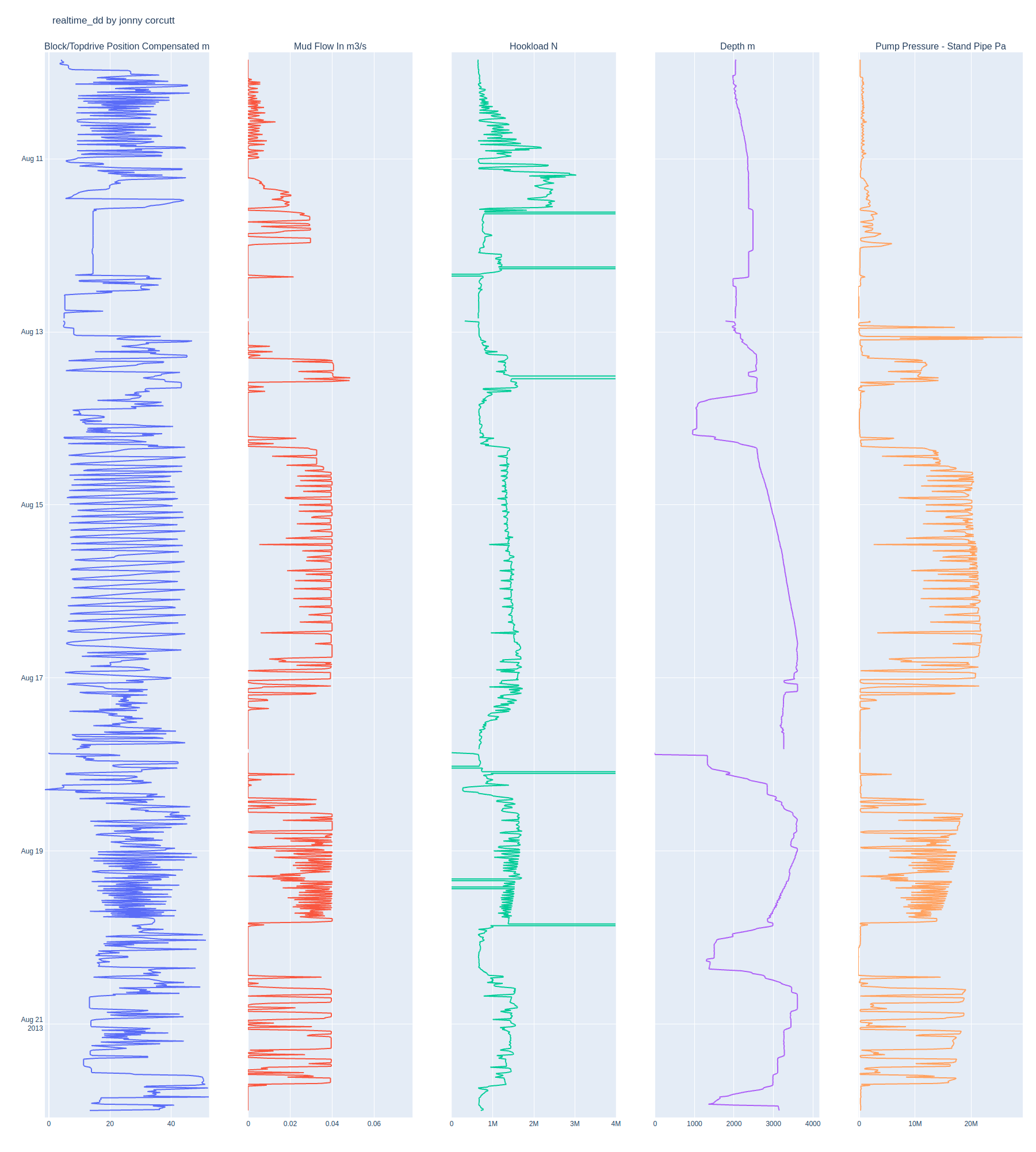
And of course, the beauty of using plotly is that the graph is interactive.
As usual, the Python script is available to use here.